By Ankit Srivastava – Lead Digital Marketing Analyst & IT Trainer, Slidescope Institute
🎯 Objective
In this chapter, you’ll master how to create Bar Charts and Pie Charts using the Plotly library in Python.
Both are essential for categorical and proportional data visualization — helping you tell stories about campaign performance, audience demographics, regional sales, or content engagement.
We’ll explore:
- Simple and grouped bar charts
- Horizontal and stacked bar charts
- Pie and donut charts
- Advanced customization and interactivity
- Real-world use cases for marketers and data analysts
🔷 Introduction: Why Bar and Pie Charts Matter
In real-world data analytics — whether in marketing, eCommerce, or business intelligence — not all data represents trends over time.
Sometimes, you need to answer questions like:
- Which ad campaign generated the most leads?
- Which region or country performed better in sales?
- What’s the percentage contribution of each traffic source?
That’s where Bar Charts (for comparison) and Pie Charts (for composition) come into play.
Plotly makes these visualizations interactive, clean, and presentation-ready, perfect for embedding in reports, dashboards, or client presentations.
📊 Section 1: Bar Charts
A bar chart is ideal for comparing categories side by side. Each bar’s length or height represents its value — making it visually intuitive to spot differences.
Plotly offers several types of bar charts through plotly.express and plotly.graph_objects.
🔹 Example 1: Simple Vertical Bar Chart
import plotly.express as px

data = {
    'Campaign': ['Google Ads', 'Meta Ads', 'LinkedIn Ads', 'YouTube Ads'],
    'Leads Generated': [250, 180, 90, 140]
}

fig = px.bar(data,
             x='Campaign',
             y='Leads Generated',
             title='Leads Generated by Campaign',
             color='Campaign',
             text='Leads Generated')

fig.show()
✅ Explanation:
x→ campaign namesy→ leads countcoloradds differentiation for better readabilitytextdisplays the exact value on each bar
🔍 Business Insight:
You can instantly see that Google Ads delivered the highest leads, while LinkedIn Ads underperformed — guiding budget allocation decisions.
🔹 Example 2: Horizontal Bar Chart
Horizontal bars are great for long labels or when you want a more compact view.
fig = px.bar(data,
             x='Leads Generated',
             y='Campaign',
             orientation='h',
             title='Leads Generated (Horizontal View)',
             color='Campaign',
             text='Leads Generated')

fig.show()
✅ orientation='h' flips the axes — perfect for ranking views (like Top 10 Products or Best Performing Channels).
Real world example of Plotly bar charts
import seaborn as sns
tips = sns.load_dataset('tips') # dataframe
# Load Tips Dataset

daywise_bill = tips.groupby("day")["total_bill"].sum().reset_index()
# Create Day-wise total bill dataframe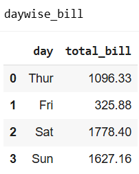
Create Vertical Bar Chart with Plotly
fig = px.bar(daywise_bill,
             x='day',
             y='total_bill',
             title='Total Bill by Day',
             color='day',
             text='total_bill')

fig.show()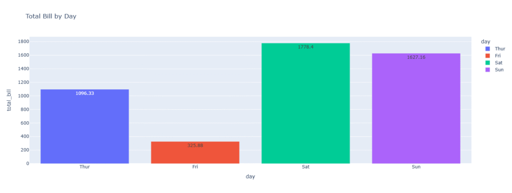
# Horizontal Bar with orientation parameter
fig = px.bar(daywise_bill,
             x='total_bill',
             y='day',
             orientation='h',
             title='Total Bill by Day',
             color='day',
             text='total_bill')

fig.show()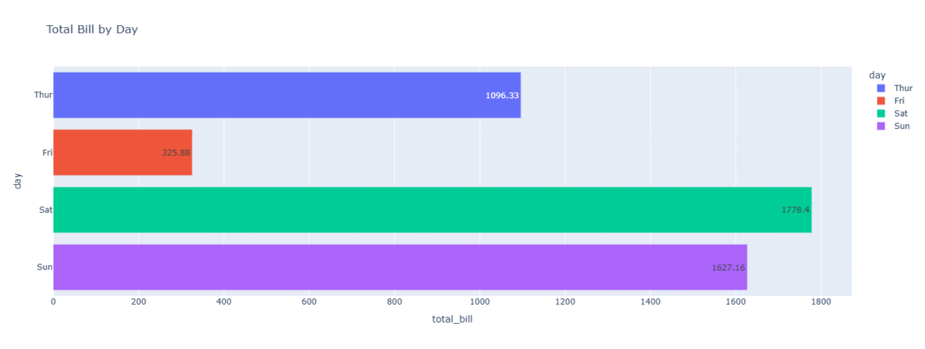
💡 Real-Life Application
As a digital marketing analyst:
You can use horizontal bars to rank:
- Top 10 performing keywords
- Best email campaigns
- Most visited pages or landing pages
Plotly’s interactivity helps stakeholders hover and inspect precise performance numbers — much clearer than static Excel charts.
🔹 Example 3: Grouped Bar Chart
Use grouped bar charts when comparing two or more variables across categories — e.g., leads vs conversions for each campaign.
import pandas as pd
import plotly.express as px

df = pd.DataFrame({
    'Campaign': ['Google Ads', 'Meta Ads', 'LinkedIn Ads', 'YouTube Ads'] * 2,
    'Metric': ['Leads']*4 + ['Conversions']*4,
    'Count': [250, 180, 90, 140, 200, 130, 70, 100]
})

fig = px.bar(df,
             x='Campaign',
             y='Count',
             color='Metric',
             barmode='group',
             title='Leads vs Conversions by Campaign',
             text='Count')

fig.show()
✅ Interpretation:
Each campaign now has two bars side-by-side — making it easy to compare how well leads converted into sales or registrations.
🔹 Example 4: Stacked Bar Chart
Stacked bars show part-to-whole relationships — useful when you want to visualize total performance while showing each component’s share.
fig = px.bar(df,
             x='Campaign',
             y='Count',
             color='Metric',
             barmode='stack',
             title='Total Leads and Conversions (Stacked)',
             text='Count')

fig.show()
✅ Insight:
Google Ads shows the tallest total bar, confirming it’s the most productive source overall.
Stacked charts are perfect when presenting total revenue, engagement, or traffic divided by channels, regions, or product lines.
🧱 Customizing Bar Charts
You can easily enhance readability and aesthetics:
fig.update_layout(
    title='Campaign Performance Overview',
    xaxis_title='Marketing Channel',
    yaxis_title='Count',
    template='plotly_white',
    legend_title='Metrics'
)
To change colors:
fig.update_traces(marker_color=['#007bff', '#00b894'])
To add animation:
fig.update_layout(transition_duration=500)
💼 Marketing Use Case Example
Imagine you’re preparing a monthly performance report for your client:
- Google Ads – 250 leads, 200 conversions
- Meta Ads – 180 leads, 130 conversions
- LinkedIn Ads – 90 leads, 70 conversions
With a single Plotly chart, you can:
- Show comparisons visually
- Hover for tooltips showing exact figures
- Export or embed the graph into a dashboard or presentation
This replaces long spreadsheets with a story-driven, interactive visualization that clients instantly understand.
🥧 Section 2: Pie Charts
Pie charts display data as proportions of a whole — each slice represents a category’s percentage contribution.
While bar charts are better for comparison, pie charts are excellent for showing composition (e.g., traffic sources, market share, budget allocation).
🔹 Example 5: Simple Pie Chart
fig = px.pie(data,
             names='Campaign',
             values='Leads Generated',
             title='Lead Share by Campaign')

fig.show()
✅ Explanation:
- Each campaign is represented as a slice of the pie.
- Hovering shows the exact share percentage and value.
🔍 Insight:
If Google Ads covers 40% of total leads, it visually reinforces its importance in your marketing mix.
🔹 Example 6: Adding Hover and Color Customization
You can enrich the chart with hover information and custom colors.
fig = px.pie(data,
             names='Campaign',
             values='Leads Generated',
             title='Lead Share by Campaign',
             color_discrete_sequence=px.colors.sequential.RdBu,
             hover_data=['Leads Generated'])

fig.update_traces(textposition='inside', textinfo='percent+label')
fig.show()
✅ Enhancement:
textinfo='percent+label'displays labels and percentages inside slices.hover_dataadds more details when users hover.color_discrete_sequenceapplies a professional color palette.
🔹 Example 7: Donut Chart (Ring Chart)
A donut chart is a variation of a pie chart with a blank center. It looks elegant and is widely used in dashboards.
fig = px.pie(data,
             names='Campaign',
             values='Leads Generated',
             title='Lead Distribution by Campaign',
             hole=0.4)

fig.update_traces(textposition='inside', textinfo='percent+label')
fig.show()
✅ Insight:
Donut charts are excellent when you want to add a central annotation (e.g., “Total Leads: 660”).
🔹 Example 8: Exploded Pie Chart (Pull-Out Effect)
Sometimes, you want to emphasize a specific category (like the top-performing campaign).
fig = px.pie(data,
             names='Campaign',
             values='Leads Generated',
             title='Highlighting Top Campaign',
             hole=0.3)

fig.update_traces(pull=[0.1, 0, 0, 0])  # Pull out the first slice
fig.show()
✅ This “explodes” the first slice, drawing immediate attention — useful for highlighting the best performer in reports.
🧮 Combining Bar and Pie Charts
Often, a single visualization type isn’t enough. For example, you might want to show both absolute numbers (bar) and proportion (pie) together.
Plotly can integrate both types into a dashboard layout using make_subplots.
from plotly.subplots import make_subplots
import plotly.graph_objects as go

fig = make_subplots(rows=1, cols=2, specs=[[{'type':'bar'}, {'type':'pie'}]])

# Bar Chart
fig.add_trace(
    go.Bar(x=data['Campaign'], y=data['Leads Generated'], name='Leads'),
    row=1, col=1
)

# Pie Chart
fig.add_trace(
    go.Pie(labels=data['Campaign'], values=data['Leads Generated'], name='Share'),
    row=1, col=2
)

fig.update_layout(title_text='Leads Overview: Absolute and Percentage View')
fig.show()
✅ Business Advantage:
This dual view instantly conveys both total performance and share contribution — a hallmark of good dashboard design.
🎨 Styling and Custom Themes
Plotly supports themes that improve presentation consistency.
Popular options include:
plotly_white– clean, minimalplotly_dark– great for dashboardspresentation– suitable for client reports
Example:
fig.update_layout(template='plotly_dark')
You can also export your visualizations as:
fig.write_html('chart.html')
fig.write_image('chart.png')
This makes it easy to embed charts in dashboards, web apps, or PowerPoint slides.
💼 Real-World Case Study
Scenario:
You are analyzing monthly performance data for four marketing campaigns.
| Campaign | Leads | Cost ($) |
|---|---|---|
| Google Ads | 250 | 5000 |
| Meta Ads | 180 | 4000 |
| LinkedIn Ads | 90 | 3000 |
| YouTube Ads | 140 | 3500 |
You can:
- Use a bar chart to show absolute leads by campaign.
- Use a pie chart to show the share of total leads.
- Calculate Cost per Lead (CPL) and plot it as a second bar chart for comparison.
This analysis visually reveals which campaign delivers the best ROI.
For example:
- Google Ads: Highest leads, moderate cost — efficient.
- LinkedIn Ads: Lowest leads but higher CPL — needs optimization.
This level of insight is exactly what data-driven digital marketers and analysts strive to communicate.
🧩 Summary
| Chart Type | Best For | Example Use Case | Plotly Function |
|---|---|---|---|
| Bar Chart | Comparing categories | Leads by campaign, sales by region | px.bar() |
| Horizontal Bar | Rankings and long labels | Top 10 pages, top keywords | orientation='h' |
| Grouped Bar | Comparing two metrics | Leads vs conversions | barmode='group' |
| Stacked Bar | Showing part-to-whole within total | Total sales with breakdown | barmode='stack' |
| Pie Chart | Showing proportions | Traffic source share | px.pie() |
| Donut Chart | Showing proportions elegantly | Market share visualization | hole=0.4 |
| Exploded Pie | Highlighting key segment | Top-performing campaign | pull=[...] |
🎓 What’s Next
In Chapter 4 – Histograms and Box Plots in Plotly, we’ll explore data distribution visualization — essential for analyzing audience behavior, performance variability, and detecting outliers in analytics or financial data.
You’ll learn how to use histograms, box plots, and violin plots to understand the spread and shape of your data like a true analyst.