🎯 Objective
In this chapter, you’ll understand what Plotly is, why it’s widely used for interactive data visualization, and how to install and set it up in your Python environment.
📊 What is Plotly?
Plotly is a powerful Python library for creating interactive, publication-quality visualizations directly in your browser or Jupyter Notebook.
Unlike Matplotlib or Seaborn, which generate static plots, Plotly allows zooming, hovering, filtering, and real-time interactivity — ideal for dashboards, analytics tools, and business intelligence applications.
💡 Why Use Plotly?
Plotly is popular because it bridges the gap between data analysis and presentation:
- ✅ Interactive Visualizations – Zoom, hover tooltips, click-to-filter.
- ✅ Beautiful by Default – Modern, clean, and responsive design.
- ✅ Supports Multiple Chart Types – From simple line charts to complex 3D surface plots.
- ✅ Web Integration – Integrates seamlessly with web apps via Plotly Dash.
- ✅ Business-Friendly – Ideal for dashboards built for marketing analytics, sales data, or social media KPIs.
⚙️ Installation and Setup
You can install Plotly via pip:
pip install plotly
If using Jupyter Notebook, also install:
pip install notebook
Then, in your Python environment:
import plotly.express as px
import plotly.graph_objects as go
📈 Your First Plotly Graph
Let’s create a simple line chart using Plotly Express:
import plotly.express as px

# Sample data
data = {
    'Month': ['Jan', 'Feb', 'Mar', 'Apr', 'May'],
    'Sales': [15000, 18000, 24000, 22000, 30000]
}

# Create figure
fig = px.line(data, x='Month', y='Sales', title='Monthly Sales Growth')

# Show figure
fig.show()
# See Output Image below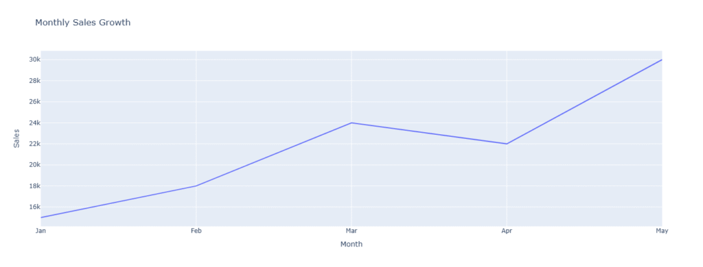
🔹 This creates an interactive line chart — you can hover over points, zoom, and export the plot as an image.
🧱 Plotly Modules Overview
Plotly has two main interfaces:
| Module | Description | Best For |
|---|---|---|
| plotly.express | High-level interface | Quick charts with few lines of code |
| plotly.graph_objects | Low-level interface | Full customization and control |
| dash | Web framework built on Plotly | Building interactive dashboards |
📦 Example: Using graph_objects
import plotly.graph_objects as go

fig = go.Figure(
    data=go.Bar(x=['Google', 'Facebook', 'LinkedIn'], y=[250, 180, 120])
)

fig.update_layout(
    title='Ad Campaign Performance',
    xaxis_title='Platform',
    yaxis_title='Leads Generated'
)

fig.show()
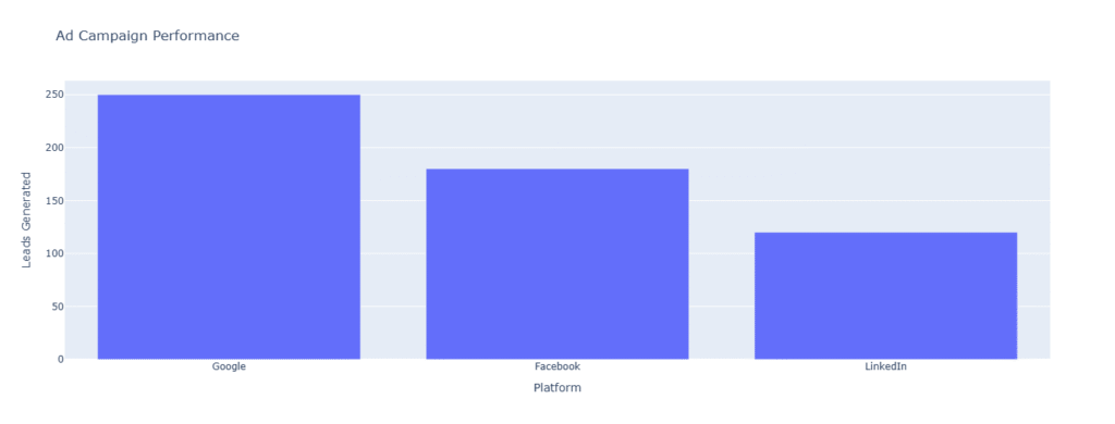
This produces an interactive bar chart — perfect for comparing marketing or sales data.
💼 Real-Life Example for Marketers and Analysts
Imagine you’re analyzing traffic sources from Google Analytics. Plotly lets you:
- Visualize traffic trends over time (line chart).
- Compare campaign performance (bar chart).
- Show device usage or region share (pie chart).
- Create interactive dashboards combining all metrics.
🧩 Summary
| Concept | Description |
|---|---|
| Plotly | A Python library for interactive, web-based visualizations |
| Installation | pip install plotly |
| Two Interfaces | plotly.express (easy) and plotly.graph_objects (customizable) |
| Ideal For | Data analysts, marketers, and BI professionals |
| Output Format | HTML-based, interactive charts |