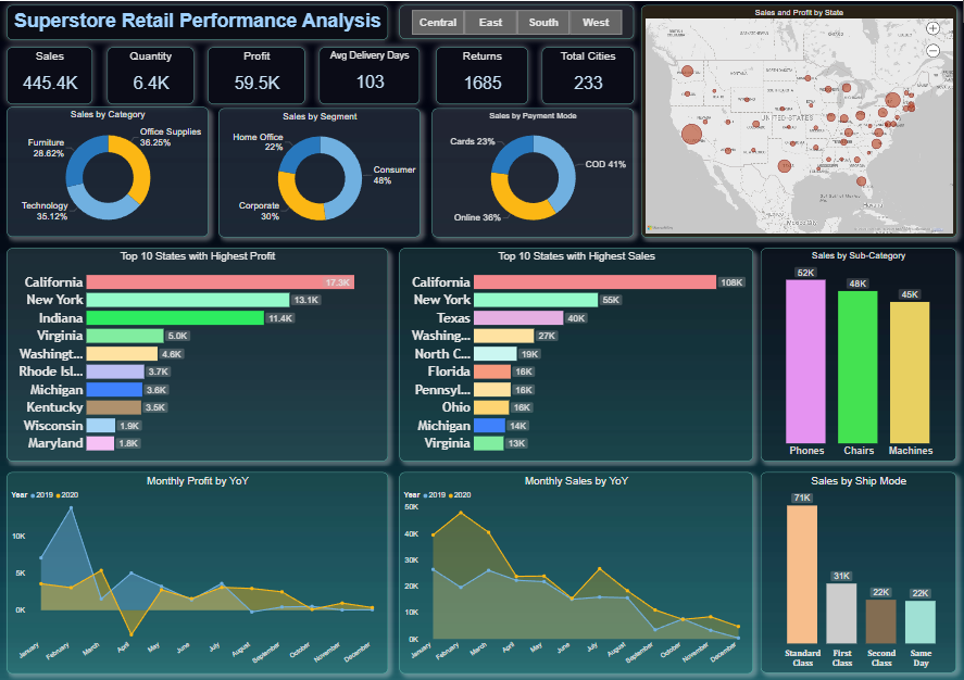
This report is a Power BI dashboard focusing on Superstore Retail Performance Analysis. It provides key performance indicators (KPIs), charts, and visualizations to analyze sales, profit, and other metrics. Here’s an explanation from a Power BI perspective:
1. Key Metrics at the Top
- Sales (445.4K): Total revenue generated.
- Quantity (6.4K): Number of items sold.
- Profit (59.5K): Net profit earned.
- Avg Delivery Days (103): Average time taken to deliver orders.
- Returns (1685): Number of items returned.
- Total Cities (233): Geographical spread of operations.
These are aggregated figures displayed prominently, often created using card visuals in Power BI.
2. Sales Breakdown
- Sales by Category: A pie chart showing the distribution across Furniture (28.62%), Office Supplies (36.25%), and Technology (35.12%).
- Sales by Segment: Consumer (48%), Corporate (30%), and Home Office (22%).
- Sales by Payment Mode: Cards (23%), Cash on Delivery (41%), and Online (36%).
These pie charts or donut charts are created using categorical dimensions and sales metrics.
3. Geographic Insights
- Sales and Profit by State: A bubble map visualizing state-wise performance. Larger bubbles indicate higher sales or profit.
- Created using map visuals, with metrics linked to geographical fields (e.g., State).
4. State-wise Analysis
- Top 10 States with Highest Profit: Horizontal bar chart showing states like California (17.3K) and New York (13.1K) leading in profit.
- Top 10 States with Highest Sales: Horizontal bar chart ranking states, with California leading at 108K.
These are bar charts with a focus on ranking by sorting descending values.
5. Sub-Category and Ship Mode Analysis
- Sales by Sub-Category: Bar chart with Phones (52K), Chairs (48K), and Machines (45K) leading.
- Sales by Ship Mode: Bar chart showing sales via Standard Class (71K), First Class, Second Class, and Same Day modes.
Power BI uses hierarchical filtering to break down dimensions such as sub-categories and ship modes.
6. Time Series Analysis
- Monthly Profit YoY: A line chart comparing monthly profit across 2019 and 2020.
- Monthly Sales YoY: Another line chart comparing sales trends year-over-year.
These are line charts with time-series data, showcasing trends across months and years.
Interactivity
- Filters by Region (Central, East, South, West): Likely slicers or buttons enabling users to dynamically filter the data by region.
- Interactive Tooltips: Hovering over visuals may show detailed insights for specific data points.
Use Case of Power BI Features
- Data Modeling: Relationships between tables like sales, products, and geography for seamless aggregation.
- DAX Calculations: Measures like profit margin, average delivery days, and YoY calculations.
- Bookmarks & Navigation: To toggle between regional data (e.g., Central, East).
- Themes: A dark theme for better visual contrast and readability.
This dashboard enables decision-makers to track performance, identify trends, and uncover areas for improvement in superstore retail operations.
To create the charts based on this dataset, you can follow these steps using Power BI or similar visualization tools:
1. Import Data into Power BI
- Open Power BI Desktop.
- Click Get Data > Excel/CSV, then select your dataset file.
- Load the data into Power BI.
2. Create Charts
A. Pie Charts
- Sales by Category:
- Drag the Category field to the Legend section.
- Drag the Sales field to the Values section.
- Use the Pie Chart visualization.
- Sales by Segment:
- Drag the Segment field to the Legend section.
- Drag the Sales field to the Values section.
- Choose the Pie Chart visualization.
- Sales by Payment Mode:
- Drag the Payment Mode field to the Legend section.
- Drag the Sales field to the Values section.
- Use the Pie Chart visualization.
B. Bar Charts
- Top 10 States by Sales:
- Drag the State field to the Axis section.
- Drag the Sales field to the Values section.
- Sort by descending order and limit the visualization to the top 10 states.
- Top 10 States by Profit:
- Repeat the steps above but replace Sales with Profit.
- Sales by Sub-Category:
- Drag the Sub-Category field to the Axis section.
- Drag the Sales field to the Values section.
- Sales by Ship Mode:
- Drag the Ship Mode field to the Axis section.
- Drag the Sales field to the Values section.
C. Line Charts
- Monthly Sales/Profit YoY:
- Create a calculated column for Month-Year using DAX:
MonthYear = FORMAT('Table'[Order Date], "MMM YYYY") - Drag the new MonthYear column to the Axis section.
- Drag Sales or Profit to the Values section.
- Use the Line Chart visualization.
- Create a calculated column for Month-Year using DAX:
D. Maps
- Sales and Profit by State:
- Drag the State field to the Location section.
- Drag Sales and Profit fields to the Size and Tooltips sections, respectively.
- Use the Map visualization.
3. Interactivity
- Add Slicers for fields like Region, Category, or Segment to make the dashboard interactive.
- Enable Cross-Filtering between visuals for dynamic insights.
4. Formatting
- Apply data labels for charts for clarity.
- Use themes and color palettes for better visual appeal.