Bar plots (or bar charts) are used to represent categorical data with rectangular bars. The length or height of the bar corresponds to the value of the category. Bar plots are ideal for comparing different categories or groups.
In this chapter, we’ll cover:
- Basic bar plots
- Horizontal bar plots
- Grouped and stacked bar plots
- Customizing colors, labels, and widths
1. What is a Bar Plot?
A bar plot displays data in rectangular bars, where each bar represents a category:
- Vertical bar plot: Categories on the x-axis, values on the y-axis
- Horizontal bar plot: Categories on the y-axis, values on the x-axis
Bar plots are useful for:
- Comparing sales across products
- Survey results
- Population counts
- Any categorical data comparison
2. Creating a Basic Vertical Bar Plot
import matplotlib.pyplot as plt

# Data
categories = ['A', 'B', 'C', 'D']
values = [10, 15, 7, 12]

# Vertical bar plot
plt.bar(categories, values)

# Add labels and title
plt.xlabel("Categories")
plt.ylabel("Values")
plt.title("Basic Vertical Bar Plot")

# Show plot
plt.show()
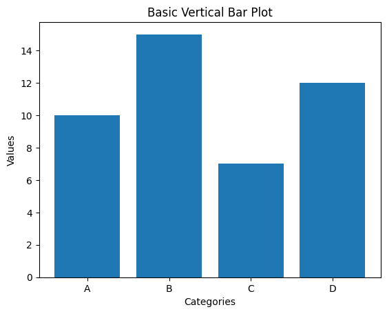
✅ Each bar represents a category with a height proportional to its value.
Fitness Dataset Example
import pandas as pd
df = pd.read_csv('https://raw.githubusercontent.com/slidescope/Fitness-Health-Tracking-Dataset/refs/heads/main/fitness_health_tracking.csv')
df.head()
X = df.Activity_Type
Y = df.Calories_Burned
plt.bar(X, Y)
plt.xlabel("Activity Type")
plt.ylabel("Calories Burned")
plt.title("Avg. Calories Burned Per Activity Type")
plt.show()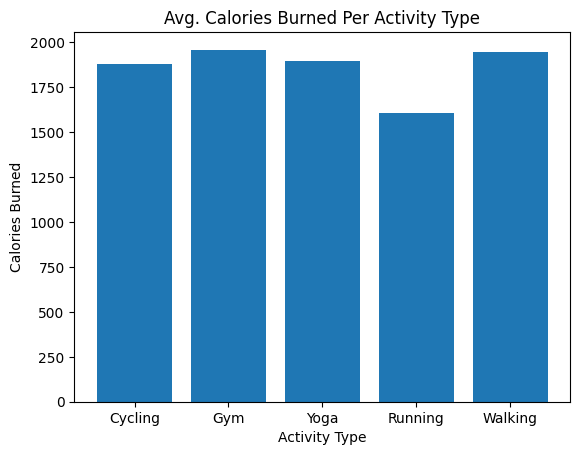
3. Horizontal Bar Plot
Sometimes, horizontal bars make it easier to read category labels:
plt.barh(categories, values, color='green')
plt.xlabel("Values")
plt.ylabel("Categories")
plt.title("Horizontal Bar Plot")
plt.show()
4. Customizing Colors and Width
You can customize bar colors and widths:
plt.bar(categories, values, color=['red', 'blue', 'green', 'orange'], width=0.5)
plt.title("Bar Plot with Custom Colors and Width")
plt.show()
colorcan be a single color or a list for each barwidthcontrols bar thickness (default is 0.8)
5. Adding Value Labels on Bars
It’s often useful to display the value on top of each bar:
bars = plt.bar(categories, values, color='skyblue')

for bar in bars:
    yval = bar.get_height()
    plt.text(bar.get_x() + bar.get_width()/2, yval + 0.5, yval, ha='center')

plt.title("Bar Plot with Values")
plt.show()
6. Grouped Bar Plot
To compare multiple series side by side:
import numpy as np

categories = ['A', 'B', 'C', 'D']
values1 = [10, 15, 7, 12]
values2 = [8, 12, 5, 10]

x = np.arange(len(categories))  # the label locations
width = 0.35  # width of the bars

plt.bar(x - width/2, values1, width, label='Series 1')
plt.bar(x + width/2, values2, width, label='Series 2')

plt.xticks(x, categories)
plt.xlabel("Categories")
plt.ylabel("Values")
plt.title("Grouped Bar Plot")
plt.legend()
plt.show()
7. Stacked Bar Plot
To show part-to-whole relationships:
plt.bar(categories, values1, label='Series 1')
plt.bar(categories, values2, bottom=values1, label='Series 2')

plt.xlabel("Categories")
plt.ylabel("Values")
plt.title("Stacked Bar Plot")
plt.legend()
plt.show()
Here, bottom=values1 stacks the second series on top of the first.
8. Customizing Bar Patterns and Transparency
You can add patterns (hatch) and transparency (alpha) for better visualization:
plt.bar(categories, values1, color='blue', alpha=0.7, hatch='/')
plt.title("Bar Plot with Pattern and Transparency")
plt.show()
alphacontrols transparency (0.0 to 1.0)hatchadds patterns like'/','\\','x','o'
✅ Summary
In this chapter, you learned how to:
- Create vertical and horizontal bar plots
- Customize colors, widths, and labels
- Display value labels on bars
- Create grouped and stacked bar plots
- Use patterns and transparency for better visualization
Bar plots are essential for comparing categories and understanding distributions in categorical datasets.