Matplotlib is one of the most popular Python libraries for data visualization. Whether you’re exploring data, building dashboards, or preparing reports, Matplotlib provides a powerful foundation for creating a wide variety of static, animated, and interactive plots.
In this chapter, we’ll cover:
- What Matplotlib is and why it’s used
- Key features of Matplotlib
- Installing and importing Matplotlib
- Anatomy of a plot
- Your first Matplotlib plot
1. What is Matplotlib?
Matplotlib is a 2D plotting library in Python that allows you to create:
- Line charts
- Bar charts
- Histograms
- Scatter plots
- Pie charts
- Heatmaps
- And much more
It is widely used because it integrates well with NumPy, Pandas, and Jupyter Notebooks, making it an essential tool for data scientists, analysts, and researchers.
2. Key Features of Matplotlib
✅ Wide variety of plots – from basic to advanced
✅ Highly customizable – colors, labels, styles, sizes
✅ Works seamlessly with NumPy arrays and Pandas DataFrames
✅ Interactive support (with Jupyter Notebook and matplotlib’s interactive backends)
✅ Supports publication-quality figures
3. Installing Matplotlib
You can install Matplotlib using pip:
pip install matplotlib
If you’re using Anaconda, it usually comes pre-installed. Otherwise, you can install it with:
conda install matplotlib
4. Importing Matplotlib
The most commonly used module in Matplotlib is pyplot, which provides a MATLAB-like plotting framework.
import matplotlib.pyplot as plt
We usually use the alias plt by convention.
5. Anatomy of a Matplotlib Plot
A Matplotlib plot has several components:
- Figure: The overall window or page that everything is drawn on.
- Axes: The area where data is plotted (like one graph). A figure can have multiple axes.
- Axis: The x-axis and y-axis that define the plot.
- Labels and Title: Text describing axes and the chart.
- Legend: Explains different lines, bars, or markers.
Here’s a quick diagram to visualize:
+---------------------------------+
|             Figure              |
|  +---------------------------+  |
|  |          Axes             |  |
|  |   +-------------------+   |  |
|  |   |     Data Plot     |   |  |
|  |   +-------------------+   |  |
|  +---------------------------+  |
+---------------------------------+
6. Your First Plot
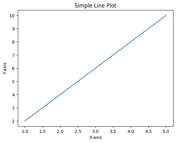
Let’s create a simple line plot.
import matplotlib.pyplot as plt

# Data
x = [1, 2, 3, 4, 5]
y = [2, 4, 6, 8, 10]

# Create plot
plt.plot(x, y)

# Add title and labels
plt.title("Simple Line Plot")
plt.xlabel("X-axis")
plt.ylabel("Y-axis")

# Show the plot
plt.show()
Output:
A straight line graph showing a linear relationship between x and y.
7. Customizing the Plot
You can customize your plot with color, markers, and line style:
plt.plot(x, y, color='red', marker='o', linestyle='--')
plt.title("Customized Line Plot")
plt.xlabel("X-axis")
plt.ylabel("Y-axis")
plt.show()
This will give you a red dashed line with circular markers.
8. Why Start with Matplotlib?
While there are other libraries like Seaborn and Plotly, Matplotlib remains the foundation. In fact, many advanced visualization libraries are built on top of Matplotlib.
Learning Matplotlib gives you the flexibility to customize every detail of your plots, which is especially useful for research papers, dashboards, and publications.
✅ Summary
In this chapter, you learned:
- What Matplotlib is and why it’s used
- How to install and import Matplotlib
- The anatomy of a plot
- How to create and customize your first line plot
In the next chapter, we’ll explore Line Plots in detail, covering multiple lines, legends, gridlines, and advanced styling.
👉 Up next: Chapter 2 – Line Plots in Matplotlib