Line plots are one of the most common types of plots in data visualization. They are used to display trends over a continuous variable, such as time, or to show relationships between variables. In this chapter, we’ll dive deeper into creating and customizing line plots in Matplotlib.
1. What is a Line Plot?
A line plot connects individual data points with a straight line. It is ideal for showing:
- Trends over time (time series data)
- Comparisons between variables
- Patterns in continuous data
2. Basic Line Plot
Let’s start with a simple example:
import matplotlib.pyplot as plt

# Data
x = [1, 2, 3, 4, 5]
y = [2, 4, 6, 8, 10]

# Create line plot
plt.plot(x, y)

# Add labels and title
plt.xlabel("X-axis")
plt.ylabel("Y-axis")
plt.title("Basic Line Plot")

# Show plot
plt.show()
✅ This will generate a simple straight line connecting the points.
3. Plotting Multiple Lines
You can plot multiple lines on the same axes to compare datasets.
x = [1, 2, 3, 4, 5]
y1 = [2, 4, 6, 8, 10]
y2 = [1, 3, 5, 7, 9]

plt.plot(x, y1, label="Line 1", color="blue", marker="o")
plt.plot(x, y2, label="Line 2", color="green", marker="s")

plt.title("Multiple Line Plot")
plt.xlabel("X-axis")
plt.ylabel("Y-axis")
plt.legend()  # Show legend
plt.show()
Here:
labeldefines the legend entrymarkeradds markers for each pointcolorchanges the line color
Another example of Plotting Multiple lines:
# sales vs profit vs month line chart of 12 months
months = ["Jan", "Feb", "Mar", "Apr", "May", "Jun", "Jul", "Aug", "Sep", "Oct", "Nov", "Dec"]
sales = [100, 120, 150, 180, 200, 220, 250, 280, 300, 350, 324, 340]
profit = [50, 60, 70, 80, 90, 100, 110, 120, 130, 140, 150, 160]

plt.plot(months, sales, label="Sales", color="blue", marker="o")
plt.plot(months, profit, label="Profit", color="#1E9E44", marker="s")
plt.title("Sales Vs Profit per Month")
plt.xlabel("Months")
plt.ylabel("Sales/Profit")
plt.legend()
plt.show()

# Output is given below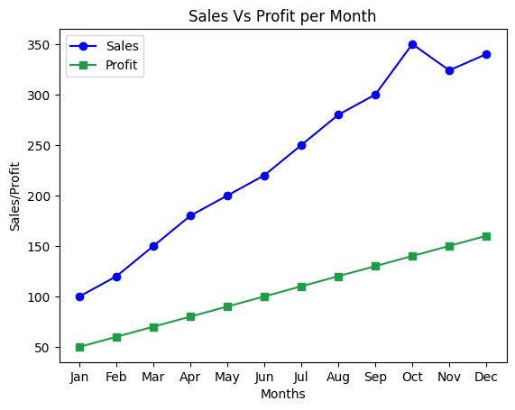
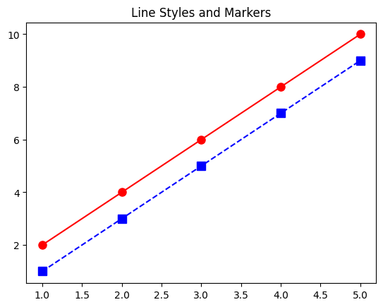
4. Line Styles and Markers
Matplotlib allows extensive customization:
plt.plot(x, y1, linestyle='-', color='red', marker='o', markersize=8)
plt.plot(x, y2, linestyle='--', color='blue', marker='s', markersize=8)
plt.title("Line Styles and Markers")
plt.show()
linestyleoptions:'-'(solid),'--'(dashed),':'(dotted),'-.'(dash-dot)markeroptions:'o','s','^','D'and moremarkersizecontrols marker size
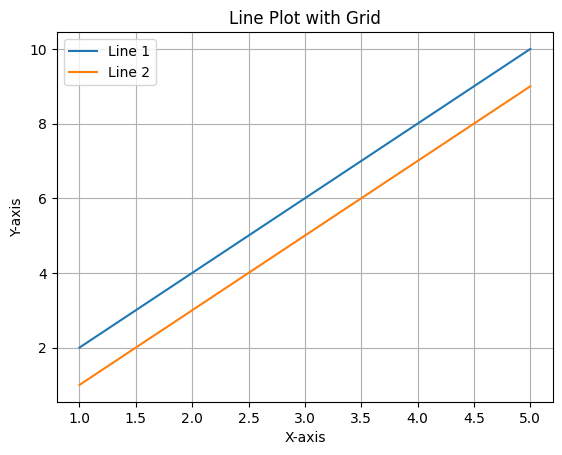
5. Adding Gridlines
Gridlines make your plot easier to read:
plt.plot(x, y1, label="Line 1")
plt.plot(x, y2, label="Line 2")
plt.title("Line Plot with Grid")
plt.xlabel("X-axis")
plt.ylabel("Y-axis")
plt.grid(True)  # Enable grid
plt.legend()
plt.show()
You can also customize grid style:
plt.grid(color='gray', linestyle='--', linewidth=0.5)
6. Customizing Axis Limits
You can manually control the range of axes:
plt.plot(x, y1, label="Line 1")
plt.xlim(0, 6)
plt.ylim(0, 12)
plt.title("Custom Axis Limits")
plt.xlabel("X-axis")
plt.ylabel("Y-axis")
plt.legend()
plt.show()
7. Adding Annotations
Annotations help highlight important points:
plt.plot(x, y1, label="Line 1", marker='o')
plt.annotate("Peak", xy=(5, 10), xytext=(3, 9),
             arrowprops=dict(facecolor='black', shrink=0.05))
plt.title("Line Plot with Annotation")
plt.xlabel("X-axis")
plt.ylabel("Y-axis")
plt.legend()
plt.show()
8. Plotting Time Series Data
Line plots are perfect for time series data:
import matplotlib.pyplot as plt
import pandas as pd

dates = pd.date_range('2025-01-01', periods=5)
values = [100, 120, 90, 150, 130]

plt.plot(dates, values, marker='o')
plt.title("Time Series Line Plot")
plt.xlabel("Date")
plt.ylabel("Value")
plt.grid(True)
plt.show()
Matplotlib can handle datetime objects directly for the x-axis.
✅ Summary
In this chapter, you learned how to:
- Create basic and multiple line plots
- Customize line styles, markers, and colors
- Add gridlines, legends, axis limits, and annotations
- Plot time series data
Line plots are versatile and form the foundation for more complex plots like trend analysis, moving averages, and forecasting.